Case study | 2019
ANA: All Nippon Airways

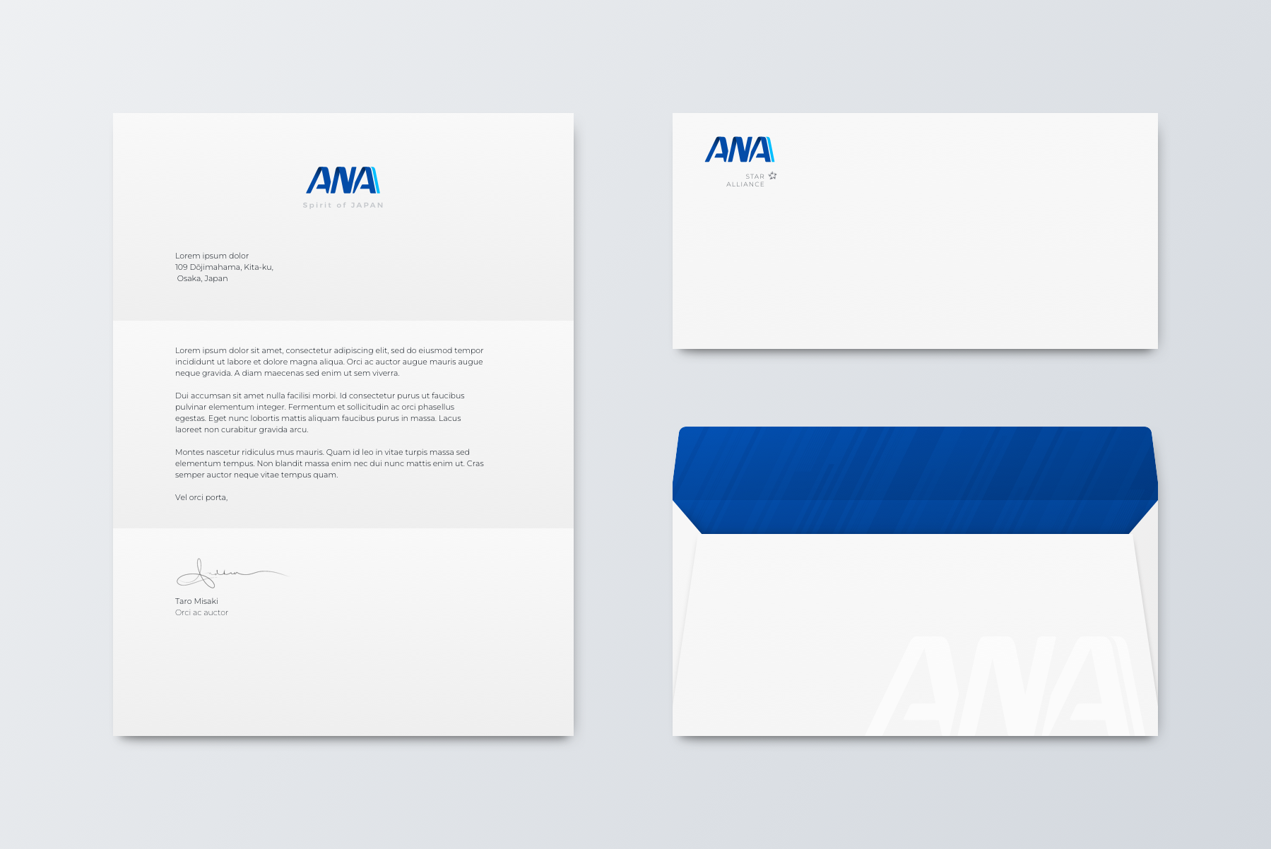
Brand refresh – a case study
Brand Refresh for Japan's ANA (All Nippon Airways). This project focuses on the comprehensive brand refresh for ANA, aimed at enhancing the overall brand identity while preserving its core values. The objective is to elevate ANA's market presence and customer connection through a modernized visual and experiential approach.
Develop a contemporary brand identity that reflects ANA's dedication to innovation and customer satisfaction.
Create a cohesive visual language that enhances brand recognition and loyalty.
Reinforce ANA's position as a premium airline offering unique experiences.
Maintaining the colors and essence of the original logo and branding, I aimed to create a fresh appearance that remains easily recognizable.
Paper & digital tickets
Paper and digital (mobile) ticket redesigned for ANA. The layout is meant to help the travel read the information with the same flow they experience going to the airport: Date, time, gate, and seat number.
The redesign of the ANA member club card focuses on achieving a cleaner, more elegant aesthetic while minimizing unnecessary visual noise.